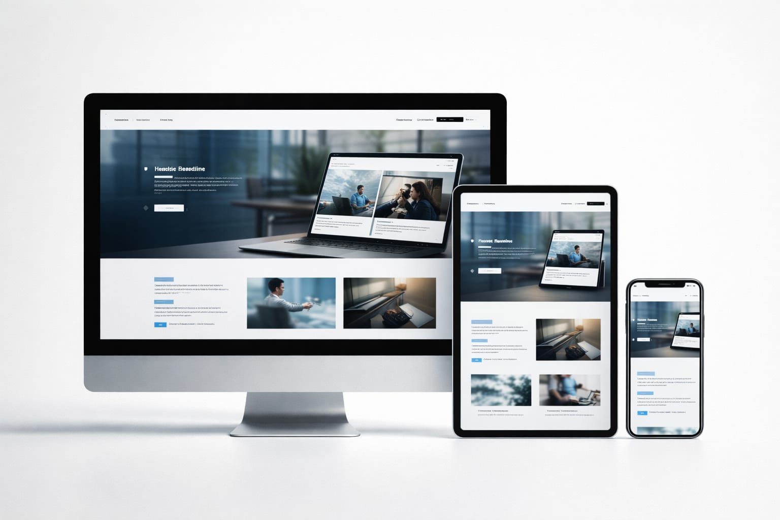






There's a pattern I've seen on too many projects. A client comes in with a design they love — it looks stunning on their desktop monitor. "Can you build this?" Absolutely. Then, three months later: "Oh, we should probably make it work on phones too." That conversation always ends the same way — expensive, painful, and full of compromises.
Responsive design isn't a feature you add at the end. It's an architectural decision you make at the beginning. And in 2026, with mobile traffic surpassing desktop on nearly every category of website, treating it as an afterthought is a business risk.
The Numbers That Should Shock You
More than half of all web traffic worldwide now comes from phones. These aren't edge cases; they're your users.
Google has used mobile-first indexing since 2019. That means Google's crawlers evaluate your mobile site first when determining your search rankings. A site that looks perfect on desktop but breaks on mobile isn't just bad UX — it's actively harming your SEO.
Mobile-first isn't a design trend. It's a reflection of how the world actually accesses the internet — especially for billions of users in emerging markets.
My Mobile-First Process

When I start a new project, the first wireframes are always for a 375px viewport — roughly the width of an iPhone. Not because desktop doesn't matter, but because designing small-to-large forces better decisions.
1. Content hierarchy first
On a 375px screen, you can only show what matters most. This constraint forces you to prioritize: What is the single most important thing on this page? What does the user need to do? Every element that doesn't serve those goals gets cut or deprioritized. The result is a leaner, more focused design — one that actually works better on desktop too.
2. Fluid grids over fixed layouts
I use CSS Grid and Flexbox almost exclusively. Forget pixel-perfect fixed widths — design with proportions. A card that takes up 100% on mobile, 50% on tablet, and 33% on desktop is far more maintainable than three separate layout rules.
3. Touch targets and spacing
Fingers are not cursors. The minimum touch target size should be 44x44px (Apple HIG) or 48x48dp (Material Design). Navigation links that work fine with a mouse can become unusable frustrations on a touchscreen. I test every interactive element with my actual thumb.
4. Performance as part of responsiveness
Responsive isn't just about layout — it's about performance on the connection speeds mobile users actually have. That means optimized images (WebP format, lazy loading, proper srcset), minimal JavaScript, and critical CSS inlined. A layout that adapts to screen size but loads slowly on 4G isn't truly responsive in the way that matters.
Common Mistakes I See (And How to Fix Them)
Fixed-width containers
Setting width: 960px and calling it done. Use max-width with width: 100% instead. Always.
Images that overflow
Every project starts with img { max-width: 100%; height: auto; } in my reset CSS. An image that overflows its container breaks the layout on mobile and is embarrassingly basic to fix.
Hover-only interactions
Navigation dropdowns that only appear on hover don't work on touchscreens. Design interactions that work with tap/touch first, then enhance for pointer devices.
Tiny text
16px is the minimum readable body font size for most users. Don't go below it. And remember — what looks fine on your retina display may look tiny on a mid-range Android phone.
Testing only in Chrome DevTools
Browser device simulators are useful but imperfect. They don't replicate real touch behavior, real performance constraints, or real rendering differences across mobile browsers. Test on actual devices. A secondhand Android phone is a worthwhile development tool.
The Standard I Hold Every Project To
Before any site I build goes live, it has to pass what I call the "stranger's phone test." I hand my phone to someone who hasn't been part of the project and ask them to complete the main user journey without guidance. If they hesitate, fumble, or give up — something is wrong with the responsive experience, and it gets fixed before launch.
This low-tech approach catches real problems that Lighthouse scores and automated accessibility checkers miss. Real users on real devices in real conditions are the ground truth — and responsive design is ultimately about serving them.